Ever get bored of the same old pie chart or graph to represent the data found? While going through my Google Reader today, I found a really cool article about market research companies starting to show data in a unique way! Check out the images below:
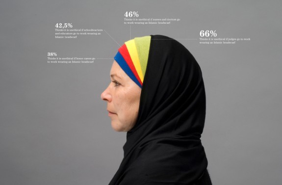
Poll results of Danish Opinion about wearing religious symbols in public professional jobs. (38% think its unethical for women to go to work with the head piece, 42.5% think its unethical for school teachers and educators to wear traditional Islamic headpieces at schools, 46% think its unethical for nurses and doctors to wear Islamic headpieces, and 66% think its unethical for judges to wear traditional head pieces.) Flowing Data
This image represents the amount of changed behavior Danish people have experienced due to gang related crime. For more visual representations check out Behance Network's website
I am more interested in figures that are displayed in a unique way than just the traditional pie chart or graph. Wouldn't you agree?

No comments:
Post a Comment